Groovy Daisies Tough Phone Case, 1970s retro illustration, vintage phone cover, iPhone 15, 16 and 17 case, summer gift
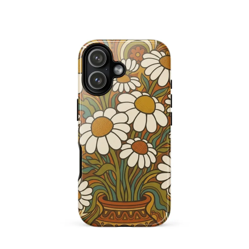
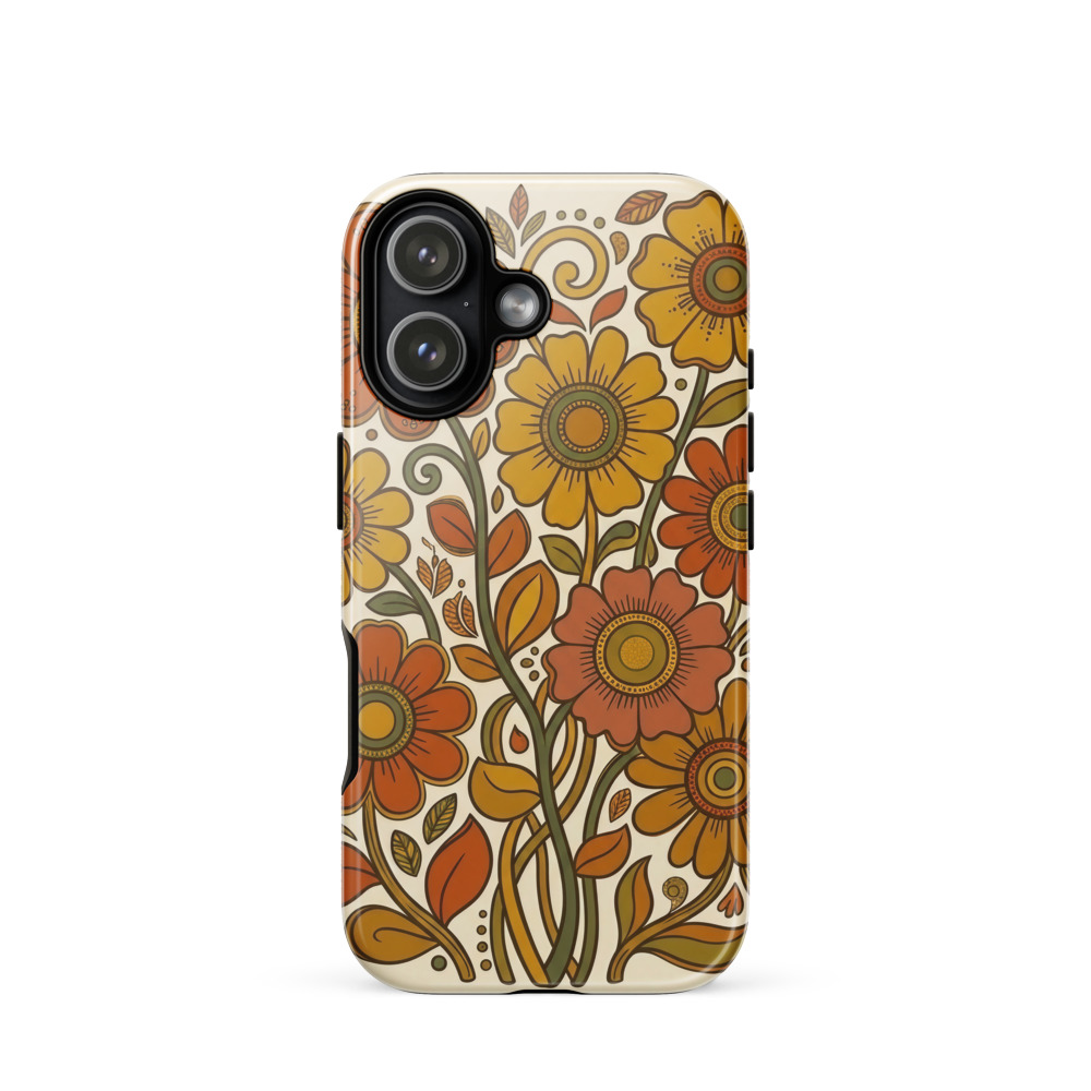
A cluster of groovy daisies in burnt orange and mustard brings a 1970s poster feel to this Tough Phone Case. Bold flat shapes, warm earth tones, and a simplified folk-art look create a cheerful retro summer accent, while the case material gives the artwork a finished everyday accessory setting. A colorful gift for vintage style and flower lovers.
The eye meets a compact cluster of daisy heads arranged like a small burst of flowers, with petals pressing close together rather than spreading across an open field. Burnt orange, mustard yellow, cream, and deep brown create the palette, giving the design the warmth of dried grass, terracotta, and late-afternoon sun. The flowers are built from broad, flat shapes instead of delicate botanical detail: rounded petals, solid centres, and simple leaf forms sit together in an easy, graphic rhythm. Dark outlines give each element a clear edge, while the limited colour range keeps the composition cohesive from a distance. Nothing is shaded or rendered realistically, so the image reads quickly and cleanly. The result is a cheerful floral arrangement with enough structure to feel considered and enough irregularity to retain a hand-drawn, folk-art character. On the Tough Phone Case, these shapes become a portable piece of pattern, bringing a warm accent to an everyday accessory without relying on tiny details that disappear at a glance.
The design belongs to the visual language associated with 1970s flower power, where nature motifs were translated into bold posters, textiles, stationery, and home furnishings. One concrete marker of that period is the use of simplified, flat colour areas edged by strong rounded lines: the daisy is reduced to its most recognisable parts, then enlarged into a statement shape. The burnt orange and mustard combination also points to the era’s fondness for earthy colour schemes, moving away from crisp modern primaries toward ochre, rust, brown, and cream. Its folk-art influence comes through in the direct construction of the flowers, which feel made from cut paper or painted blocks rather than carefully modelled from life. That balance gives the illustration a familiar vintage character while keeping it uncluttered. It sits naturally within the 70s Floral & Mushroom series, alongside the kind of botanical forms that appeared on kitchen linens, record sleeves, printed ceramics, and bedroom textiles during the decade.
For a wall, this palette wants a setting that lets warm colour do the work: white, cream, pale clay, muted olive, or light wood will give the orange and mustard a clear backdrop. It suits the relaxed atmosphere of a kitchen, studio, reading corner, or sunlit hallway, especially where other small vintage-inspired objects can echo its rounded shapes. In bright natural light, the yellow petals and orange forms will feel lively, while softer evening light will bring out the brown outlines and make the arrangement appear more grounded. Avoid placing it against a busy pattern if you want the daisies to remain easy to read; a plain surface gives the bold shapes room to register. As a phone case, the artwork keeps that same visual role close at hand, fitting iPhone 15, 16, and 17 models and adding a distinct retro note to a pocket, desk, or bedside table. It makes a colourful gift for someone drawn to flowers, summer palettes, and 1970s-inspired design.
| Care | Wipe clean with a dry cloth; avoid abrasive cleaners on the printed face. |
| Shipping | Made to order — ships in 2–5 business days |